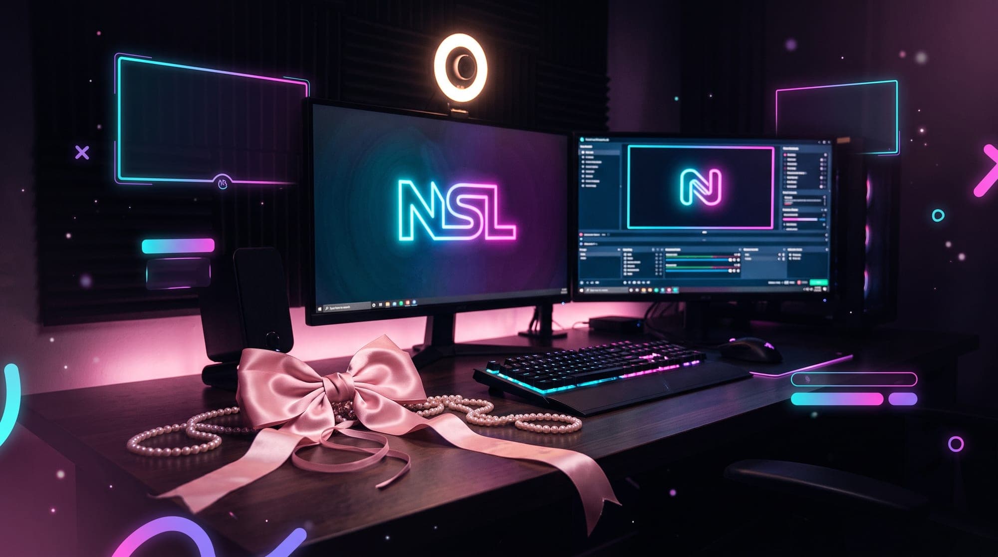
Search "coquette twitch overlay" and you get a wall of shop listings. Pink thumbnails, bows, ribbon, a lot of pearls. Not one of them tells you the thing that actually matters: coquette is the hardest aesthetic to pull off on a live stream, and most people who try it end up with a layout that looks beautiful in a preview image and turns to mush the moment someone watches it on a phone.
That is worth understanding before you buy anything, because the fix is a design decision, not a shopping decision.
Where the coquette look comes from
"Coquette" is French for flirtatious. The aesthetic built its audience on Tumblr in the early 2010s, sat quietly for a while, then exploded on TikTok around 2021 and has not really left since.
Its visual vocabulary borrows from Victorian, Edwardian, Regency and Rococo dress: lace, flounces, ribbon, bows, pearls, hearts, and a palette that stays in the soft end of pink, cream and butter yellow.
What changed in 2026 is the tone. The 2024 version of coquette leaned loud and plastic, closer to Barbiecore. The current reading is quieter and more expensive-looking, less about fragility and more about confidence in softness. For a stream layout that shift matters, because it moves the target from "as pink as possible" toward restraint, and restraint is exactly what makes this aesthetic survive compression.
Why coquette is the hardest aesthetic to get right on stream
Here is the problem nobody selling a pack will mention.
Everything that defines coquette is small and low-contrast. Lace is a fine repeating edge. Pearls are tiny highlights. Ribbon is a thin line. Those are details you read at arm's length on a printed page.
Now think about how your stream is actually watched. Very few viewers use a full-screen 1080p player. Most are in a browser window a fraction of that size, with chat open beside it, and a large share are on a phone. On top of that, your video is compressed on its way to them, and compression is at its most brutal on exactly two things: fine repeating texture and low-contrast gradients.
Lace is fine repeating texture. Pastel-on-pastel is a low-contrast gradient. Coquette is, unluckily, built almost entirely out of the two things a video encoder destroys first.
Compare that to something like the cyberpunk aesthetic, which is all hard edges and violent contrast. Cyberpunk survives a bad connection. Coquette does not, unless you design for it.
Silhouette over texture
This is the whole rule, and everything below is an application of it.
Choose shapes that are recognisable at 200 pixels wide. A bow read as a silhouette still says "bow" when it is small and blurry. A field of lace texture says "grey smudge". So:
- Use bows as anchors, not wallpaper. Two or three deliberate bows, placed at corners and on the webcam frame, do more than a repeating bow pattern across the whole canvas. The pattern disappears; the anchors survive.
- Turn ribbon into structure. Ribbon is at its best as a framing line: a border around your webcam, a divider under your chat box, a trailing tie at one corner of a screen. Given a job, it reads. Scattered, it vanishes.
- Keep lace at edges only. A lace trim along the bottom of a Starting Soon screen works. Lace behind text does not, ever.
- Let pearls be accents. A short strand along one edge is jewellery. Pearls everywhere is noise.
The counterintuitive part: a coquette layout that works on stream looks emptier than the aesthetic does in fashion. That is not a compromise, it is the translation.
The contrast trap: chat, alerts and panels
This is where most pink layouts fall apart, and it has a specific cause. Coquette palettes sit in a narrow band of lightness. Baby pink, cream, blush and off-white are all bright. Put text from one on a background from another and you have colour difference with almost no value difference, which is what your eye actually uses to separate things.
Practical consequences:
- Chat needs a value jump, not a hue change. Pink text on a cream panel is unreadable at small sizes. Deep rose or a soft charcoal on cream is readable and still reads as coquette.
- Alerts must break the palette on purpose. An alert exists to interrupt. If your follow alert is pastel pink on a pastel pink overlay, nobody notices a new follower, including you. Keep the frame coquette and make the text inside it dark and heavy.
- Panels have their own constraint. They render at a fixed narrow width on your channel page, so thin script fonts and lace borders collapse there faster than anywhere else. Our complete Twitch panels guide covers the sizing; the coquette-specific advice is to carry the theme with a bow icon and a ribbon rule, and keep the label itself in a clean readable face.
If you want the underlying theory, we broke down how to build a working palette in stream overlay colour palettes. The short version for this aesthetic: two pinks maximum, one cream or off-white, and one genuinely dark accent you are allowed to use for text. That dark accent is not a betrayal of the look. It is what makes the look legible.