Stream overlay color palette types are the design frameworks that define your channel's visual identity through a structured system of dominant, secondary, and accent colors. Choosing the right palette is not just about aesthetics. It directly shapes how viewers read your screen, recognize your brand, and stay engaged during long sessions. The industry standard for overlay color design is the 60-30-10 rule, a framework used by professional designers and top creators alike. Tools like Coolors, Photopea, and design guides from platforms like Twitch and Streamhub make it easier than ever to build a palette that works. This guide breaks down every major palette type, how to apply them, and how to pick the right one for your stream.
1. What are the foundational stream overlay color palette types?
Stream overlay color palettes fall into four core categories. Each one serves a different content style, mood, and audience expectation.
- Minimalist monochrome. This palette uses one base color in multiple shades, typically grays, whites, or muted tones, with a single accent color for alerts and key UI elements. It works best for talk shows, IRL streams, and creators who want the gameplay to stay front and center. The clean look reads well on any game background.
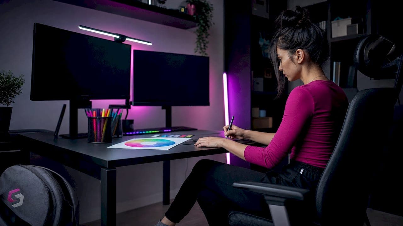
- Neon cyberpunk. This palette pairs deep blacks or dark navy backgrounds with electric neon accents like cyan, magenta, or lime green. Cyber and tech streams use neon accents on dark backgrounds to signal energy and intensity. It is the go-to for FPS, battle royale, and sci-fi game streams.
- Pastel and cute. Soft pinks, lavenders, mint greens, and warm creams define this palette. Pastel gradients suit cozy gaming, simulation titles like Animal Crossing, and variety streamers with a warm, welcoming brand. The low contrast keeps the vibe relaxed without losing readability.
- Bold contrast. This palette uses two or three high-saturation colors in direct opposition, such as deep purple against bright gold, or red against white. It creates strong visual hierarchy and works well for competitive gaming, sports streams, and creators building a bold personal brand.
Different stream categories correlate to distinct palette strategies, and customizing beyond template palettes is advised to avoid a generic appearance.
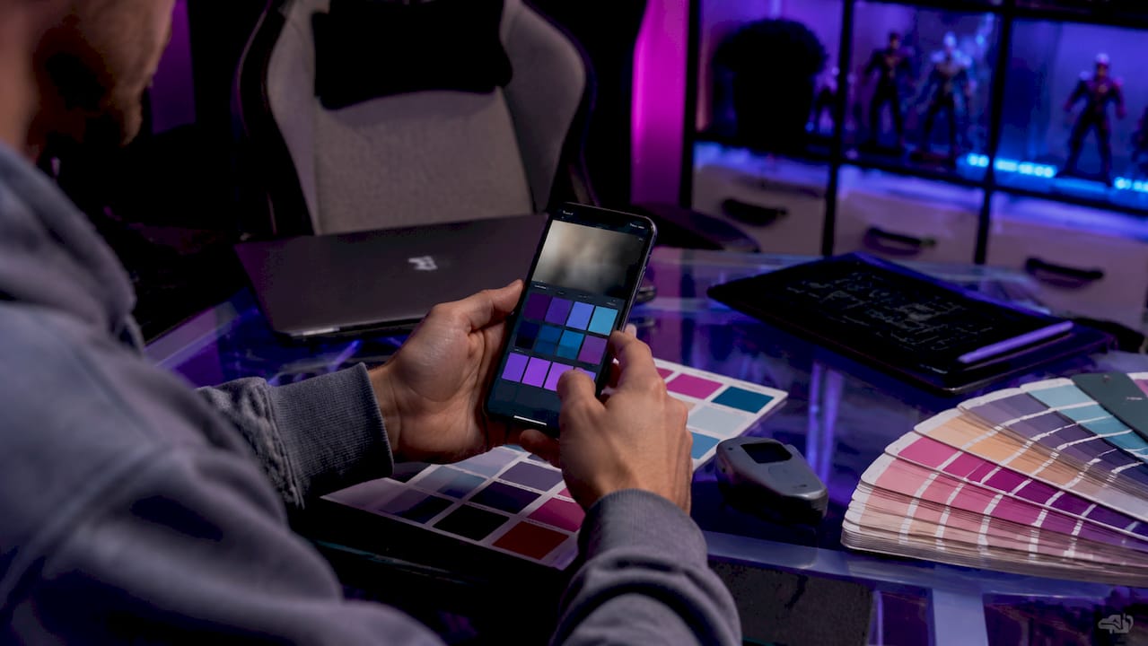
Pro Tip: Grab a screenshot of your webcam background and upload it to Coolors. The tool will extract dominant hues from your real environment, giving you a palette that already fits your setup.
2. How to apply the 60-30-10 color balance rule to your overlay
The 60-30-10 rule is the primary framework for balancing stream overlay colors. It works like this:
- 60% neutral tones. Your dominant color fills most of the overlay space. Think dark backgrounds, panel fills, and border frames. This color sets the mood without competing with gameplay.
- 30% secondary color. Your secondary color appears in mid-level elements like webcam borders, info bars, and section dividers. It reinforces your brand identity and creates visual rhythm.
- 10% accent color. Your accent is reserved for alerts, subscriber notifications, and calls to action. It should be the most eye-catching color in your palette.
This rule helps maintain visual hierarchy and reduces cognitive load by keeping overlays from competing with gameplay content. Viewers can scan your screen and instantly know where to look.
Here is how the rule maps across the four core palette types:
| Palette type |
60% dominant |
30% secondary |
10% accent |
| Minimalist monochrome |
Slate gray |
Light gray |
Single brand color |
| Neon cyberpunk |
Deep black or navy |
Dark teal or purple |
Neon cyan or magenta |
| Pastel and cute |
Soft cream or white |
Blush pink or mint |
Warm coral or lilac |
| Bold contrast |
Deep jewel tone |
Neutral gray |
Bright gold or red |
Pro Tip: If your accent color appears in more than 10% of your overlay, pull it back. Overusing your accent color trains viewers to ignore it, which defeats the purpose of alerts.
3. Comparison of stream overlay color palette styles
Picking the right overlay design color option means understanding the trade-offs between each palette type. Here is a side-by-side look:
| Palette type |
Mood |
Typical colors |
Best content fit |
Readability |
| Minimalist monochrome |
Calm, professional |
Grays, off-whites, one accent |
Talk shows, IRL, variety |
Excellent |
| Neon cyberpunk |
High energy, edgy |
Black, navy, neon cyan, magenta |
FPS, sci-fi, tech |
Good on dark games |
| Pastel and cute |
Warm, welcoming |
Pinks, lavenders, creams |
Cozy, simulation, lifestyle |
Good |
| Bold contrast |
Confident, bold |
Deep jewel tones, bright accents |
Competitive, sports, esports |
Strong with care |
Professional branding guidelines recommend limiting overlays to at most three primary colors: one dominant, one secondary, and one accent. Using more colors causes visual clutter and reduces viewer retention. That rule applies across every palette type in the table above.
Accessibility matters too. Text on overlays must remain legible regardless of the game running underneath. Bold contrast palettes can create readability problems if the accent color is placed over a busy game background. Monochrome palettes handle this best because neutral tones rarely clash with gameplay visuals.
Modular overlays with adaptable palettes avoid game-matched colors that clash with gameplay visuals. Building a core brand palette that works across multiple games keeps your brand consistent even when your game library changes.
4. Tips for customizing your overlay palette for accessibility and mobile viewers
Your overlay looks great on your 27-inch monitor. But a large portion of your viewers watch on phones or tablets, and your palette needs to hold up at small sizes too.
- Check your contrast ratios. WCAG (Web Content Accessibility Guidelines) standards recommend a minimum contrast ratio of 4.5:1 for normal text. Free tools like WebAIM Contrast Checker let you paste in your hex codes and get an instant pass or fail.
- Avoid pure black and pure white. Off-whites and slate grays reduce eye strain and improve cohesion. Pure white on a dark background creates a harsh "flashbang" effect that fatigues viewers during long sessions.
- Reserve bright colors for alerts only. Avoid highly saturated colors for base elements or body text. Bright, high-energy colors belong on alerts and moments demanding viewer attention, not on static UI panels.
- Test on a small screen. Shrink your OBS preview to phone size and check whether your text labels and health bars still read clearly. If they blur into the background, increase font weight or adjust your secondary color.
- Test on both bright and dark game scenes. Color visibility varies dramatically depending on gameplay backgrounds. A pale overlay that looks clean on a dark dungeon scene may disappear entirely during an outdoor daytime level.
Mobile readability requires high-contrast palettes with legible fonts and simple color combinations. Testing overlays at small scale is critical to retain hierarchy and viewer engagement.
Pro Tip: Use Photopea's Hue/Saturation adjustment layer to quickly shift an entire overlay pack to a new color scheme. It takes under five minutes and lets you test multiple palette options before committing.
5. How to choose stream colors that match your game and brand
Your overlay palette should never fight your game for attention. Using colors that complement your webcam background rather than competing with it creates a more cohesive visual identity for your live stream.
Start by identifying the dominant colors in the games you play most. If you stream dark, moody titles like Elden Ring or Cyberpunk 2077, a neon cyberpunk or bold contrast palette will feel native to your content. If you stream bright, colorful games like Stardew Valley or Minecraft, a pastel or monochrome palette keeps the screen balanced without adding more visual noise.
Treating color as an editorial code means each hue signals viewer priority levels and stream atmosphere rather than just decoration. Your dominant color sets the tone. Your secondary color organizes information. Your accent color demands attention. When you apply that logic consistently, viewers learn to read your screen without thinking about it.
Your brand colors also need to work outside the stream itself. Profile banners, thumbnails, and social media graphics should pull from the same palette. Consistency across every touchpoint is what turns a color scheme into a recognizable brand identity.
Key takeaways
The most effective stream overlay palette uses a disciplined three-color system built on the 60-30-10 rule, matched to your content category and tested for mobile readability.
| Point |
Details |
| Use the 60-30-10 rule |
Assign 60% to neutral tones, 30% to secondary colors, and 10% to accent highlights. |
| Limit to three colors |
More than three primary colors creates visual clutter and reduces viewer retention. |
| Match palette to content |
Neon cyberpunk fits FPS and sci-fi; pastel suits cozy and simulation streams. |
| Test for mobile viewers |
Shrink your preview to phone size and verify text and UI elements stay readable. |
| Avoid pure black and white |
Off-whites and slate grays reduce eye strain and prevent harsh contrast effects. |
What I have learned about building a stream palette that lasts
The biggest mistake I see streamers make is choosing colors they personally love rather than colors that serve their viewers. Your palette is not a mood board for your bedroom. It is a communication system. Every color on screen is telling your viewer something, whether you intend it to or not.
When I first started paying attention to overlay design, I kept gravitating toward saturated, high-energy palettes because they felt exciting. The problem was that after 30 minutes of watching, those colors became exhausting. Viewers were not staying. Once I shifted nonessential elements toward muted tones and saved bright colors for alerts only, watch time improved noticeably.
The other thing I wish someone had told me earlier: your palette will need to evolve. Regularly reviewing and pruning overlay assets keeps your brand identity fresh while staying recognizable. A palette that felt right at 50 followers may feel dated at 5,000. That is not failure. That is growth. Schedule a palette review every six months and ask yourself whether your colors still match where your channel is heading.
— manel
Ready-made overlay packs with customizable palettes at Neonstreamlab
Neonstreamlab builds animated overlay packs across every major palette type, so you do not have to start from scratch.
The Space Station Sci-Fi pack nails the neon cyberpunk palette with dark backgrounds and electric accent colors ready to drop into OBS or Streamlabs. If you want something warmer, the cozy floral and synthwave packs cover pastel and bold contrast styles. Every pack is built for quick color customization, so you can apply the 60-30-10 rule without touching a single design file. Browse the full overlay pack collection to find a palette that fits your stream, or grab something from the free overlays library to test a color scheme before committing. Over 192 streamers have rated Neonstreamlab at 4.9 out of 5, and every pack downloads instantly with original, copyright-free audio included.
FAQ
What are the main stream overlay color palette types?
The four main types are minimalist monochrome, neon cyberpunk, pastel and cute, and bold contrast. Each suits a different content category and viewer mood.
How many colors should a stream overlay use?
Professional branding guidelines recommend a maximum of three primary colors: one dominant, one secondary, and one accent. More colors create visual clutter and hurt viewer retention.
What is the 60-30-10 rule for stream overlays?
The 60-30-10 rule assigns 60% of your overlay to neutral tones, 30% to a secondary brand color, and 10% to a high-contrast accent used only for alerts and key UI elements.
How do I make my stream overlay readable on mobile?
Use high-contrast color combinations, avoid pure black and white, and test your overlay at phone screen size in OBS. WCAG standards recommend a minimum contrast ratio of 4.5:1 for text elements.
Can I use the same color palette across different games?
Yes, and you should. A modular overlay palette built around your brand colors rather than game-specific colors maintains visual consistency no matter what title you are playing.
Article generated by BabyLoveGrowth
Get matching overlays from NeonStreamLab
At NeonStreamLab we design premium animated overlay packs that already put these principles into practice — balanced colour, clean hierarchy and a cohesive look across screens, alerts, webcam frames and panels. Browse Cyberpunk overlays, Neon overlays, Cozy overlays to find a theme that fits your channel, like our Cyberpunk pack.
Every pack works with OBS, Streamlabs and StreamElements, uses original copyright-free audio, and downloads instantly. Want to try before you buy? Grab a free overlay pack and see how it looks on your stream.