Stream thumbnail and overlay consistency on YouTube means using the same color palette, fonts, layout, and design elements across your live streams and video thumbnails to build a visual identity viewers recognize instantly. This practice, known in branding as visual identity cohesion, is the difference between a channel that looks professional and one that looks like a patchwork of random design choices. Branding consistency acts as a silent salesperson for your channel, influencing whether a viewer subscribes or scrolls past. YouTube's own technical standards, like the 1280x720 pixel thumbnail spec and the sRGB color profile requirement, give you a concrete starting point for building that consistency.
What are the key design principles for stream thumbnail and overlay consistency on YouTube?
Consistent stream visuals start with a small set of rules applied everywhere. When your thumbnails and overlays share the same visual language, viewers recognize your content before they even read the title.
The core principles are:
- The 60-30-10 color rule. Use 60% neutral background, 30% secondary brand colors, and 10% high-contrast accents for calls to action. This ratio keeps your visuals balanced without looking flat.
- One signature font. Pick a single font family and use it across thumbnails, overlays, alerts, and panels. A single signature font creates instant viewer recognition without any extra effort.
- Safe design zones. Keep all critical elements, including text, faces, and key objects, within the center 1100x620 pixels of your thumbnail. YouTube's UI overlays, like duration timestamps, sit outside that zone and will cover anything you place there.
- Geometric consistency. If your overlay uses rounded corners on webcam frames, your thumbnail borders should match. Mixing sharp rectangles with soft ovals creates visual noise.
- Consistent text placement. Put your title text in the same region of every thumbnail. Viewers scan thumbnails fast, and predictable layouts help them process your content quicker.
Pro Tip: Avoid Adobe RGB or ProPhoto RGB color profiles in your thumbnail files. YouTube only renders in sRGB, so those profiles produce washed-out colors that undermine your branding immediately.
One more thing worth calling out: avoid feature creep in overlays. Adding too many elements, like chat boxes, donation tickers, follower goals, and sponsor logos all at once, clutters the screen and pulls viewer attention away from your content. Consistent typography and simple geometric shapes reduce cognitive load and keep your stream looking clean.
What tools and resources help maintain YouTube overlay and thumbnail consistency?
Having the right tools is half the battle. The other half is organizing your assets so you can actually find and reuse them.
- Create a Brand Source of Truth folder. This is a single folder, on your desktop or in cloud storage, that holds your master color codes, fonts, logo files, and graphic assets. A centralized design library eliminates the guesswork of "which shade of blue did I use last month?" and keeps every asset aligned.
- Use template-based graphic tools. Canva, Adobe Photoshop, and Affinity Designer all support reusable templates. Build one master thumbnail template and one master overlay layout, then duplicate and adjust for each stream. This cuts design time dramatically.
- Upload thumbnails 24–48 hours before your stream. Custom thumbnails uploaded early can boost click-through rates by 15–30%. That window gives YouTube time to index your thumbnail in search and recommendations before the stream goes live.
- Use version control for your assets. Name files with dates or version numbers, like "thumbnail-template-v3-2026.psd." This prevents you from accidentally using an outdated template and breaking your visual consistency.
Here is a quick reference for the core technical specs you need locked in before you design anything:
| Asset |
Spec |
Why it matters |
| Thumbnail size |
1280x720 pixels, 16:9 ratio |
Fits all YouTube display contexts |
| Max file size |
2 MB |
Larger files may fail to upload |
| Safe zone |
Center 1100x620 pixels |
Avoids UI obstruction |
| Color profile |
sRGB |
Prevents washed-out colors |
| Font usage |
One family across all assets |
Builds instant brand recognition |
For creators who want a head start on stream overlay color palettes, understanding how to apply the 60-30-10 rule to specific hue combinations makes the process much faster.
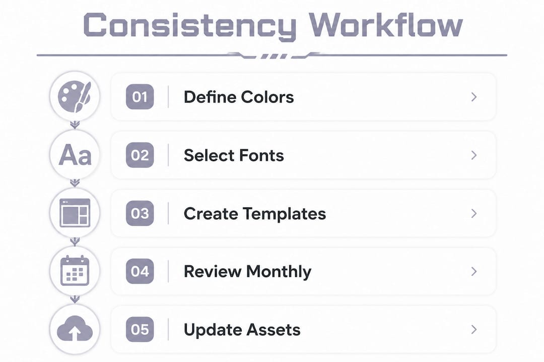
How do you create a consistent workflow for stream thumbnails and overlays?
A workflow turns good intentions into repeatable results. Without one, your branding drifts every few weeks without you noticing.
- Define your brand rules first. Write down your exact hex color codes, font names, and any style rules like "always use a drop shadow on text" or "always show face in the top-right corner." Keep this document in your Brand Source of Truth folder.
- Build reusable template sets. Create one thumbnail template and one overlay layout that reflect your brand rules. Every future design starts from these templates, not from scratch.
- Bridge your live and VOD branding. Treat overlays and thumbnails as parts of one system, not separate projects. If your overlay uses a neon green accent, that same green should appear in your thumbnail border. Successful creators adapt live stream branding into VOD thumbnails by selectively carrying over border styles and color accents.
- Schedule thumbnail uploads early. Set a reminder to upload your custom thumbnail 24–48 hours before each stream. This is one of the highest-impact habits you can build for improving click-through rates.
- Run quarterly visual audits. Pull up your last 20 thumbnails and compare them side by side. Look for font changes, color shifts, or layout drift. If something looks off, update your template before the next stream.
Pro Tip: When you update your brand colors or fonts, go back and update your templates immediately. Leaving old templates in place is the fastest way to introduce visual drift without realizing it.
Common mistakes to avoid:
- Mixing color profiles between thumbnail files and overlay exports
- Using different fonts in overlays versus thumbnails because you forgot which one you picked
- Overcrowding your thumbnail with text, graphics, and faces all competing for attention
- Skipping the safe zone rule and losing key text behind YouTube's timestamp badge
A clean, consistent layout does more for viewer trust than any single flashy design element. Think of your thumbnails and overlays as a uniform. The details matter, but the overall impression is what people remember.
How do you maintain long-term consistency in your YouTube stream branding?
Consistency is not a one-time setup. Channels that look polished a year in are the ones that treat branding as an ongoing practice, not a launch task.
Here is how to stay on track over time:
- Spot visual drift early. Visual drift happens when fonts, colors, and layouts shift slightly with each new design until your channel looks like it belongs to three different creators. Regular audits prevent this by catching small inconsistencies before they compound.
- Follow the 80/20 rule for brand evolution. Keep 80% of your branding locked in and use the remaining 20% for creative experimentation. This lets you refresh your look without confusing viewers who already recognize your channel.
- Update legacy assets promptly. When you rebrand or tweak your color palette, update every template, overlay, and channel banner in the same session. Leaving old assets in circulation creates a patchwork look that signals inconsistency.
- Adapt thumbnails for Shorts and clips without losing brand identity. Replay thumbnails work as master designs that you then reframe for Shorts and clip covers. This approach saves time and multiplies your discoverable content without starting from scratch each time.
- Experiment within boundaries. Try a new background texture or a seasonal color accent, but keep your font and layout locked. Viewers notice changes more than you think, and small surprises within a familiar frame feel fresh rather than jarring.
Pro Tip: Set a calendar reminder for a monthly 15-minute thumbnail review. Open your YouTube Studio, look at your last 10 uploads side by side, and ask yourself: "Would a new viewer think these all came from the same channel?" If the answer is no, fix the template before the next upload.
For creators building a themed channel, understanding how YouTube stream layout works gives you a structural foundation to apply these branding principles more precisely.
Key Takeaways
Stream thumbnail and overlay consistency on YouTube requires a defined color palette, a single font, reusable templates, and regular audits to prevent visual drift and build lasting viewer recognition.
| Point |
Details |
| Use the 60-30-10 color rule |
Apply 60% neutral, 30% brand color, and 10% accent across all thumbnails and overlays. |
| Build a Brand Source of Truth |
Store master hex codes, fonts, and templates in one folder to keep every asset aligned. |
| Upload thumbnails 24–48 hours early |
Early uploads can increase click-through rates by 15–30% before the stream goes live. |
| Run regular visual audits |
Monthly or quarterly reviews catch font and color drift before it damages channel credibility. |
| Apply the 80/20 rule when evolving |
Keep 80% of your branding stable and reserve 20% for creative updates to stay fresh. |
Why I think most creators get branding consistency backwards
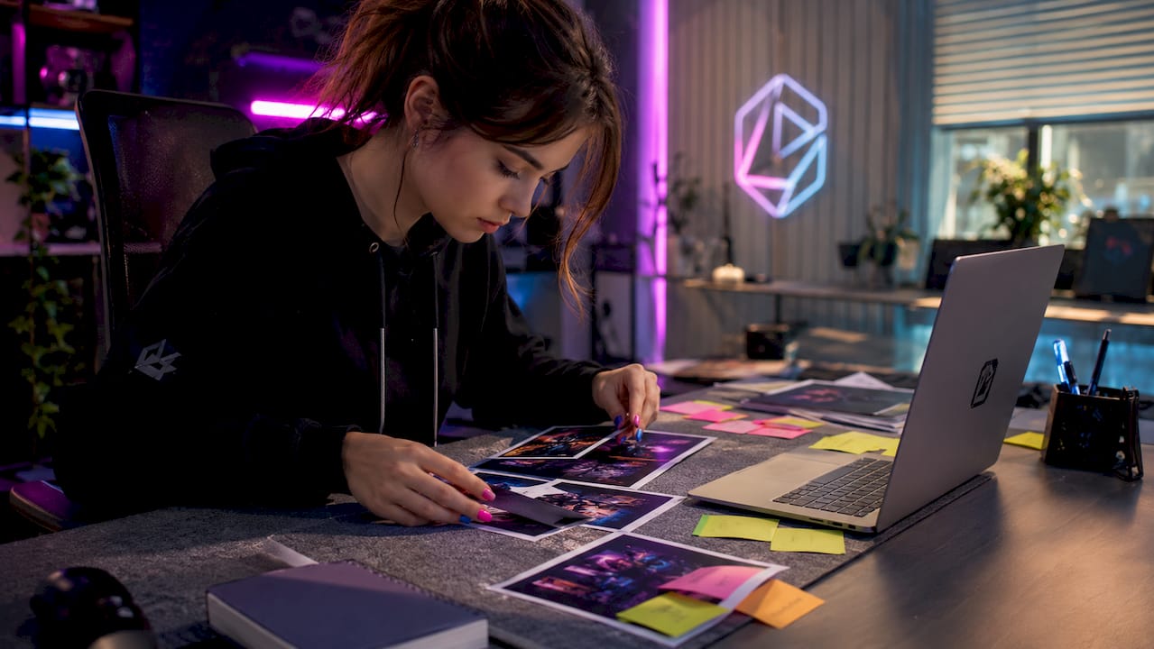
Most creators treat thumbnails and overlays as separate tasks. They design an overlay when they set up their stream, then design thumbnails on the fly before each upload. The result is a channel that looks like two different people run it.
The real shift happens when you start treating your overlay and your thumbnail as the same document. The colors, fonts, and layout rules should be identical. When a viewer watches your stream and then finds your VOD later, the visual connection should be immediate. That recognition is what builds the kind of trust that turns casual viewers into subscribers.
The Brand Source of Truth folder sounds like extra work, but it saves hours over a year. Every time you open a new design file, you are not hunting for the right shade of blue or trying to remember which font you used. You just open the template and go. That speed compounds over time.
The hardest part is the audit habit. Most creators skip it because nothing feels urgently broken. But visual drift is slow and invisible until it is not. I have seen channels with great content lose credibility simply because their thumbnails from six months ago look nothing like their current ones. Viewers notice, even if they cannot articulate why.
— manel
Neonstreamlab makes stream branding consistency easier
Getting your overlays and thumbnails to match is much simpler when your overlay pack is already built around a cohesive visual theme.
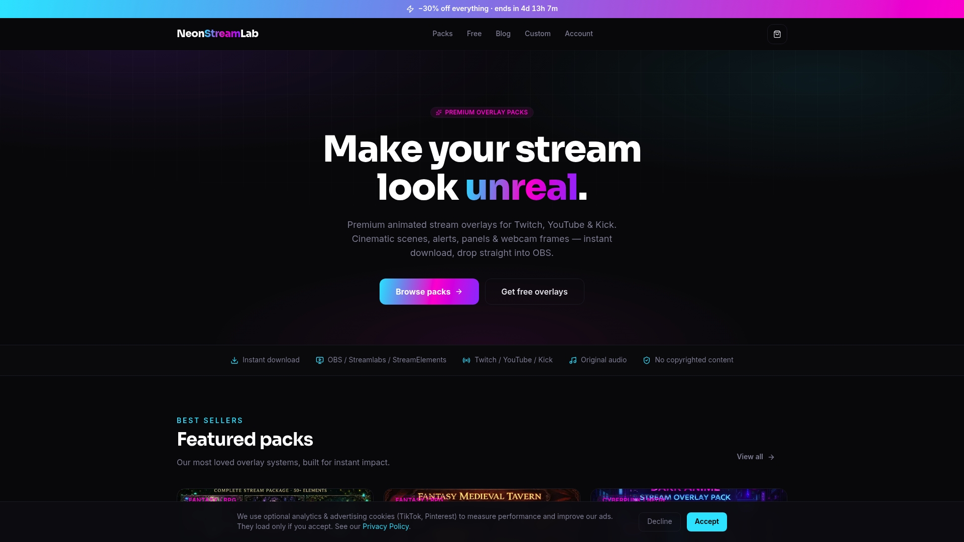
Neonstreamlab offers animated overlay packs designed for YouTube, Twitch, and Kick, with themes ranging from dark anime and cyberpunk to cozy and fantasy aesthetics. Every pack includes webcam frames, alerts, and panels that share the same color language, so your live stream already looks like a branded production. All packs work with OBS, Streamlabs, and StreamElements, download instantly, and include original copyright-free audio. Over 192 streamers have rated Neonstreamlab at 4.9/5. Browse the full overlay pack collection or grab a free overlay to see the quality for yourself before committing.
FAQ
What size should YouTube stream thumbnails be?
YouTube stream thumbnails should be 1280x720 pixels at a 16:9 ratio with a maximum file size of 2 MB. Always use the sRGB color profile to prevent washed-out colors on YouTube's display.
How does the 60-30-10 rule apply to stream overlays?
The 60-30-10 rule means 60% of your overlay and thumbnail space uses a neutral background, 30% uses your secondary brand color, and 10% uses a high-contrast accent for key elements like alerts or text highlights.
What is a Brand Source of Truth for streamers?
A Brand Source of Truth is a single folder containing your master hex color codes, fonts, logo files, and graphic templates. It keeps every thumbnail and overlay asset consistent without relying on memory.
How often should I audit my YouTube stream branding?
Monthly or quarterly audits are the standard recommendation. Pull up your last 10 to 20 thumbnails side by side and check for font, color, or layout drift that has crept in over time.
Can I use the same thumbnail design for YouTube Shorts and clips?
Yes. Start with your replay thumbnail as the master design, then reframe it for Shorts and clip covers while keeping the same fonts, colors, and border style. This saves time and keeps your brand identity consistent across all content formats.
Get matching overlays from NeonStreamLab
At NeonStreamLab we design premium animated overlay packs that already put these principles into practice — balanced colour, clean hierarchy and a cohesive look across screens, alerts, webcam frames and panels. Browse Cyberpunk overlays, Neon overlays, Anime overlays to find a theme that fits your channel, like our Cyberpunk pack.
Every pack works with OBS, Streamlabs and StreamElements, uses original copyright-free audio, and downloads instantly. Want to try before you buy? Grab a free overlay pack and see how it looks on your stream.
